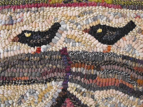
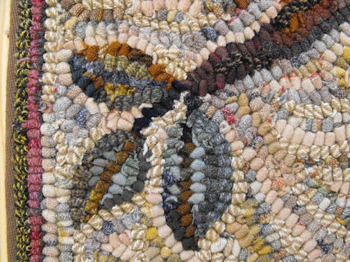
Home Tweet Home was part of the initial Primitive Spirit pattern offerings, and creating it helped form my personal style. Let’s take a closer look.
First you should notice that this design has very simple contrasts. There is the light background and the dark motifs. Pretty straightforward and uncomplicated. If you squint your eyes you can see how starkly motifs stand out against the background. If you are just beginning your journey with color, a simple high contrast color plan such as this is a good place to start. If you learn how to create a light against dark contrast with value, you have learned the most important key to working with color.
The background is a light value backdrop for all of the motifs to play against. The motifs are little more than silhouettes, hooked with a few dark values. Suggestions of detail are all that is needed for the eye to figure out the rest.
The background was just as fun to hook as the motifs for me, because I was experimenting with blending. I had 5 or 6 light values in wool, some were too white and cold looking, so I made a strong batch of regular tea, and used it to stain or dye those colors. Tea dyeing often gives light colors a peachy-tan tint, which looks nice and aged. When I tea stain, I usually fix the color as I do with acid dyes with wool, using vinegar or citric acid.
After muddying the stark whites, I hooked all of my colors into the background. The trick is to think of each section of the background as an important shape, and hook it with as much attention as a motif. The goal is to make quiet blends.
I am always in a quandary about signing my rugs. Sometimes I mean to, but just forget. Other times I don’t want my signature to interfere with the design. In this case I added a signature label into the binding.
Thank you for joining me today ~ Karen


great example of contrast! Love your work and loved seeing the background up close!!
LikeLike
Your blogs are a great education! Love all you do- what an inspiration!
LikeLike
I’m learning so much about color from your blog. Thank you for all of these wonderful tutorials. I go back to your posts often to glean more each time!
Hugs,
Courtney
LikeLike
I, too, am learning so much from your blog. Thank you for sharing with us.
Hugs 🙂
Lauren
LikeLike
I love your website. You are so talented. Your article on Tasha Tudor was so interesting. I have some of her books and one of her prints and I treasure them.
Thanks!
LikeLike
I look forward to all of your posts. Your work is so serene. Its wonderful
LikeLike
I am learning a lot from from your blogs on color. Choosing colors for my rugs is the hardest thing for me. Studying the close ups is really helping. Thanks.
LikeLike
yes, the color is the mystery and the magic. start with color, and make sure to pick the background color right at the start. everything plays off the background.
LikeLike
I love this rug. I am so glad you are showing up close shots. I am learning alot just from seeing your rugs up close. I really love how your backgrounds come out and seeing that you use all different colors, just in the same value really makes it stand out. From now on, instead of pulling strips out that are in the same color family, I’m going to be mixing up different colors in the same value to try out on my rugs. Thanks!!!
LikeLike
you are setting out to do something very exciting! i hope we get to hear more of your experiences, thanks for commenting.
LikeLike
Each day of reading your blog is like taking a mini-class with you. I love all the close-ups and additional stories behind the work you do. Makes us appreciate your rugs and wool dyeing, so much more. Thanks for sharing with us.
LikeLike
Thank you for this very interesting post. It is nice to see how you create such interesting backgrounds, making them a main element of the design.
LikeLike
Lovely post, beautiful rug!
LikeLike
Hi Karen, I like to work my signature and the date into the design of the rug, It’s subtly there; you have to look for it … much like the way Charles Gibson signed his Gibson Girl prints with a signature as the bottom flare of a skirt or the bottom rail of a fence.
LikeLike
that is a wonderful method, thank you for sharing.
LikeLike
I don’t remember seeing this rug before. It’s lovely. I am going to try some tea dyeing very soon, marrying some light colours… delightful!
LikeLike
thanks for the comment, and have fun with the fun dye play time!
LikeLike
Never seen, and so beautiful. I would like to make that too. But I shall not try it, to difficult I think…
LikeLike