This month I have a lot of great colors available on Etsy, and I wanted to talk a bit about the use of neutrals in a design. To see my Etsy wool click here.
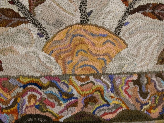
This is a close up of my rug design Jane Austen. Even though the border seems to be all colorful selections, it is really made up of 80% – 90% neutral colors. 
 Beige, tan, browns, grays, taupes and antique whites. The basket look like it is gold, but it is actually shades of camel and tan with a hint of grayed down blue.
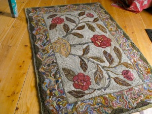
The red flowers are the “colors” in this rug. That means that approximately 90-95% of the wool needed was a neutral color.
 Spring is Here is another example of a design that is 95% neutrals. And the soft red colors are very muted. What makes them look colorful is that they are the most colorful wools used.
  Throw a too saturated color in the design, and the rest of the colors look blah, and your eye goes right to the bright color instead at looking at the birds and all the flowers.
Here are some other details that show you how key a role neutrals play in every part of a design. I find it important to have all values and temperatures of neutrals in my stash. That means, neutrals from the lightest light to the darkest dark, in everything sort of gray, to taupe, to brown, to russet, to pumpkin, to rust, to camel, to tan, to khaki, to blue-gray. Then I also consider having choices of solid and textures. Much more often the color that I really need is a neutral rather than a more saturated color. So next time when you are thinking yellow, consider trying a camel or golden brown instead.
Have a creative day ~ Karen


Still trying to emulate you!
LikeLiked by 1 person
I love your colors and designs, you just explained why the colors in your rugs are so appealing. I had not thought of color like that before!
LikeLike
thanks for commenting polly!
LikeLike
Karen, I am so glad you are back. Hope you are doing better. Sure have missed your informative tips.
LikeLiked by 1 person
Very beautiful colours 🙂
LikeLike